
This is the shot I started out with.

I learned from my research that many historical cinematic films have this warm color scheme and I wanted to implement it into my story. I started off with finding other films with warm color grading such as "The Color Purple". I think I created a good result that matches other historical movies and looks pretty good.
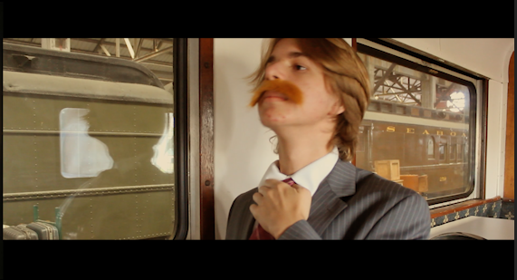
I selected these setting for the mid tones, shadows and highlights to give it that warm feeling. (The setting are at the bottom of the blog post) I actually added some warmth and yellow tint to the shot as well. These setting transformed my shots from ammeter looking to more advanced and cinematic.


No comments:
Post a Comment